Hipages
Overview
Hipages is a website that started off as a directory of tradesmen in Australia. It was unique in that we offered clients to customise their listings and include photographs of their work. We wanted to push for growth, scalability and a stronger brand prescence, the homepage was a good starting point to dictate a new style and brand.
Problem
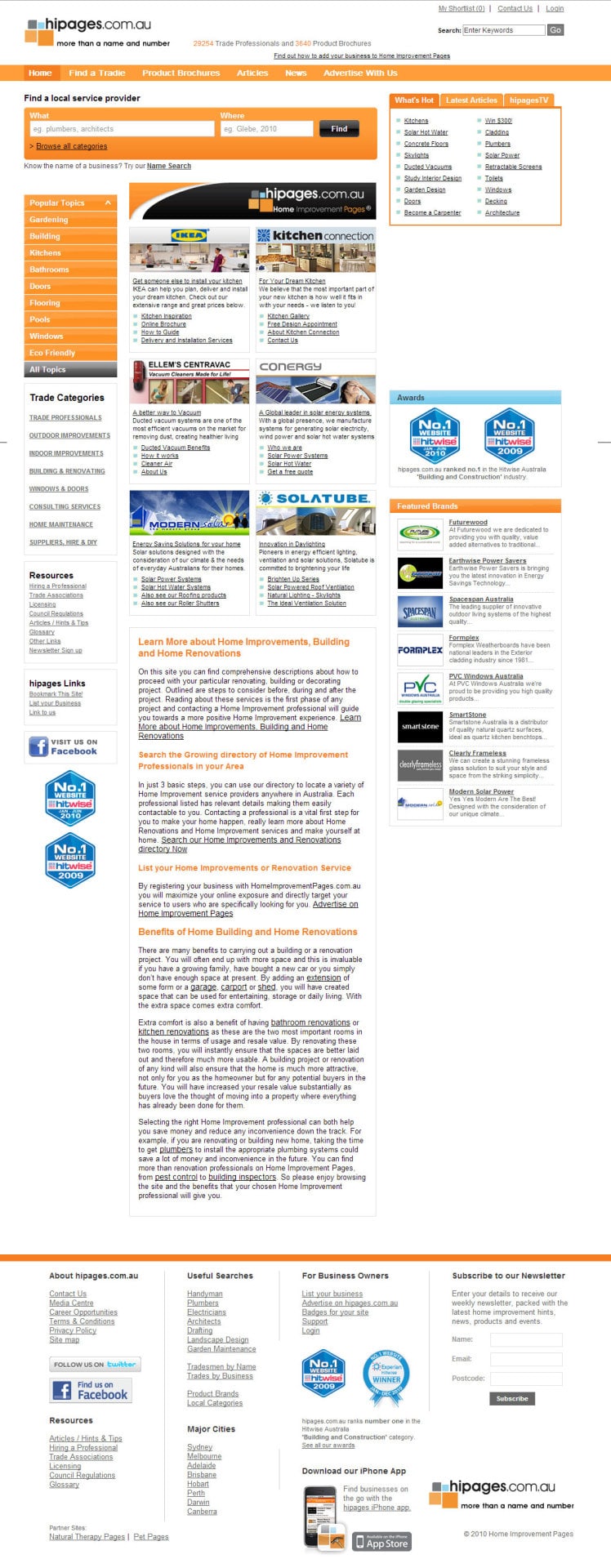
The old design was created by the founder, who was a developer in 2006 and hasn’t been updated since. Obviously a lot has since changed in terms of coding, design and web standards so there were a lot of “bad UX” across the site.
Approach
We drew lots of wireframes, quick sketches on paper and the whiteboard, collaborating with staff and informal meetings with the founder/CEO. We wanted to understand his vision for the company moving forward so that we can come up with the best solution. I knew I wanted to give it a good facelift, but without sacrificing its core objective, which is to get people searching as well as serving relevant paid ads by our clients.
Challenges
We knew what we wanted, but to get to the end goal can be challenging in terms of change. It was going to be a drastic change design wise, as well as feature wise. We wanted to be as optimistic as possible, shoot for the stars! So we designed a lot of the features we spoke about during our meetings to ensure that the design is capable of being scalable to account for them in the future.
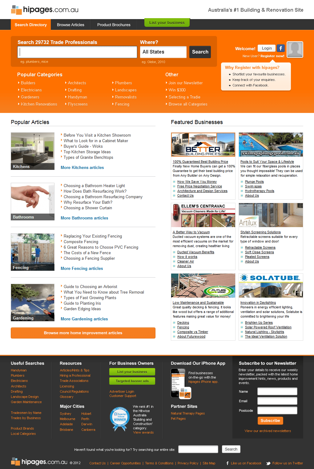
We did many iterations of the design. While we wanted to remove the Featured Business section as we felt it wasn’t quite relevant for the user, we understood the need to keep it. Those clients paid a lot to appear there, we couldn’t just remove them all of a sudden - it had be a gradual process.
Solution
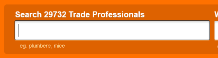
Most people who land on the site would begin searching. We designed the search field to be more prominent and the text-field to be active automatically. We removed a lot of the SEO text as it look up a large chunk of the old design and made the webpage overwhelming with text.
We found that a lot of people click on the What’s Hot links so we decided to try something and add them underneath the search field. We also wanted to increase the user’s length of stay on the site so we featured some of our most popular articles in our best categories. This helps user engagement and is great for SEO.
It was the year of social media, we wanted to push our site to be more inclusive and allow users to interact with each other & add their favourite images to their own personal gallery (similar to Pintrest).

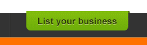
We moved the List your business to the top and give it its own colour that stood out from the rest of the site to attract potential clients in advertising their business with us.
Thoughts & Conclusion
We did well in updating an outdated website into a modern design while strengthening the brand. Many employees that have worked at Hipages for years welcomed the change with open arms.
The account managers were very pleased with the results as they have been receiving an increase in enquiries by prospective clients. We had an uptake in registered users as well, so this meant we could start pushing for more features for our users that would eventually lead in generating more business for our clients.
We plan to monitor the analytics and click heatmaps of the site and constantly make ongoing adjustments and A/B testing to increase conversion for us, as well as our clients.