Hipages
Overview
Hipages is a website that started off as a directory of tradesmen in Australia. It was unique in that we offered clients to customise their listings and include photographs of their work. As with all businesses, we started to look for ways for growth while being more efficient about it. During this time, our Pay Per Lead module was starting to gain traction and revenue.

Problem
The Pay Per Lead system would give you an id from when you signed up, so the first customer would be assigned the number 1, second customer 2 etc. The lower their number, the higher they would appear in the search results (on the right hand side, similar to Google Adwords). This was a good way to keep customers loyal, but it wasn’t very feasible in terms of aquiring new customers as there weren’t any incentives for them to join up, only to appear at the bottom of the list! We needed to overhaul that system and to go along with it, we needed to create a way for our clients to manage their own campaigns.
We relied heavily on our account managers to set everything up as well as our customer service teams to maintain it. It was tedious work and a lot of time taken to create a campaign could’ve been better spent elsewhere. An example of how tedious the work was for our account managers, was entering each and every postcode the client wanted to advertise for! We definately did not want the same process for our clients.
Approach
After meeting with the account managers and learning about their work & processes, we took to the whiteboard to quickly brainstorm ideas and draw some really quick mock ups. After having more of an idea about the project, I started to flesh out my ideas on paper and then eventually drafted some wireframes on Axure. Speaking to product managers and account managers throughout the process to make sure I was heading in the right direction.
Challenges
Most of our tradesmen are not very tech savvy, so trying to design a brand new module that they have never used before or understand was a big challenge. You also have to understand that they may not have a lot of time between jobs to manage their campaigns, so you needed it to be as easy to use as possible. I also worked on this project during the holiday season so there wasn’t a lot of staff around to bounce ideas around and to answer questions I might’ve had. It was also the first solo project I took on as my UX partner was away on holidays.
Solution
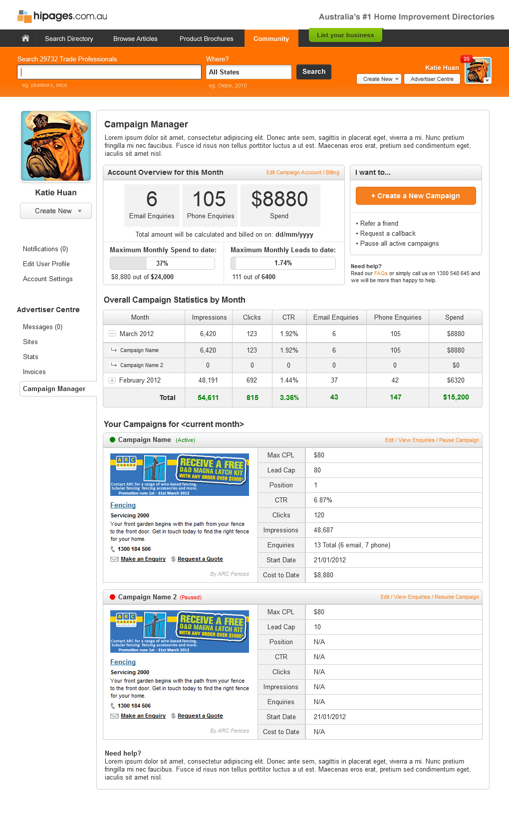
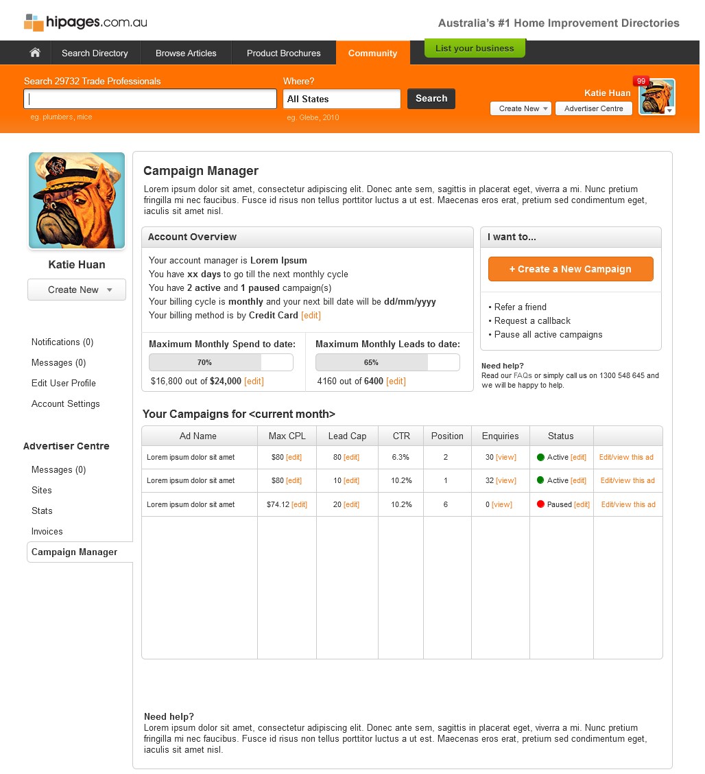
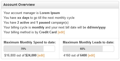
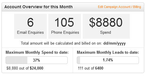
I wanted our users to be able to understand quickly where their money is going at a glance. People don’t like numbers, so it’s important to be able to show them in a simple way what each numbers represent. The solution? Progress bars!
I also needed to make the process of creating/editing an easy process so that even people who don’t really understand what a campaign is can use it. We definately could not use what our account managers use for our clients as their process was incredibly tedious. My solution to this was to really simplify as much as I could. Limiting as much typing as possible and utilise drop-down menus and button selectors.
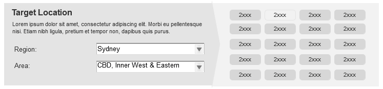
I mentioned earlier that our account managers had to enter each postcode in manually. It was one of their main complaints about using their existing system. My solution to this problem is quite simple: Show the postcodes after choosing the Region & Area and select the ones you want!
Thoughts & Conclusion
I had a lot of fun with this project, and one that I’m extremely proud of. I admit that the project was daunting at first and I was afraid of not being able to complete it by the time our sprint was over (our UX team was working in an Agile environment with monthly sprints). In the realm of design, the sections that looked the most simple and straightforward took the most amount of my time, but also the most rewarding.
We tested this quick prototype with internal staff that had zero-knowledge of campaign ads and they were able to easily create/edit a campaign and understood the whole process.
I was not around for the implementation of this project but I have heard that they have had great results with it and the account managers were begging the developers to implement the same features in their back-end 🥰😊