Ozbargain
Overview
Ozbargain is one of the most popular sites visited in Australia. It’s a community based website featuring user generated content. Bargain hunters and savvy shoppers take part by sharing, upvoting/downvoting and commenting on deals they or others have found. I decided it would be a fun side-project to give a crack at redesigning it as well as fix some of the nagging issues I had with the site’s navigation.
Problem
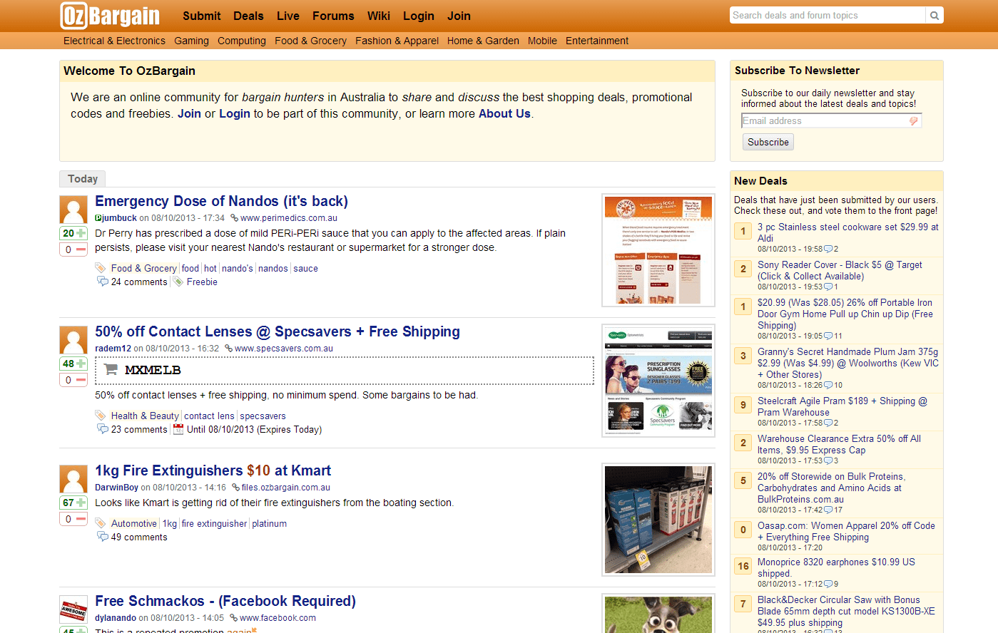
It is 2013 and the website still looked like it has never been updated since the “Web 2.0” style was the trend. Now there’s nothing wrong with this per-say, but since it was a personal project, I made this as one of my problems :P
As the website is powered by user generated content, I feel that it is important to make the user feel like they’re part of the community, which would make them more inclined to participate. I believe this is achieved through the encouragement of registering for an account, without being too demanding.
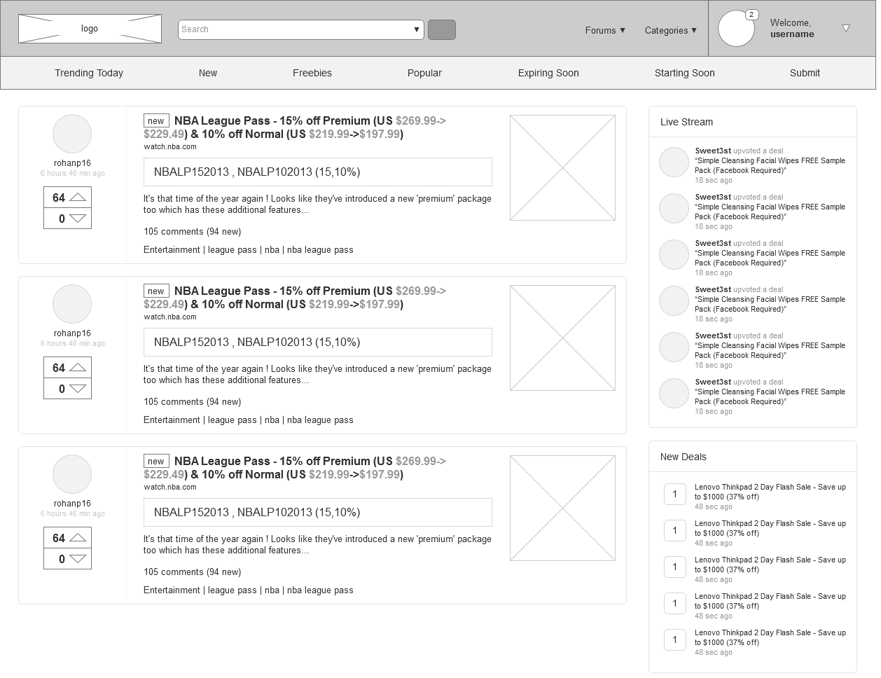
There was way of displaying if you had any notifications if you were logged in. The logged-in state needed some personality so that the user feels a sense of ownership of the account and thus the feeling of being part of the community.
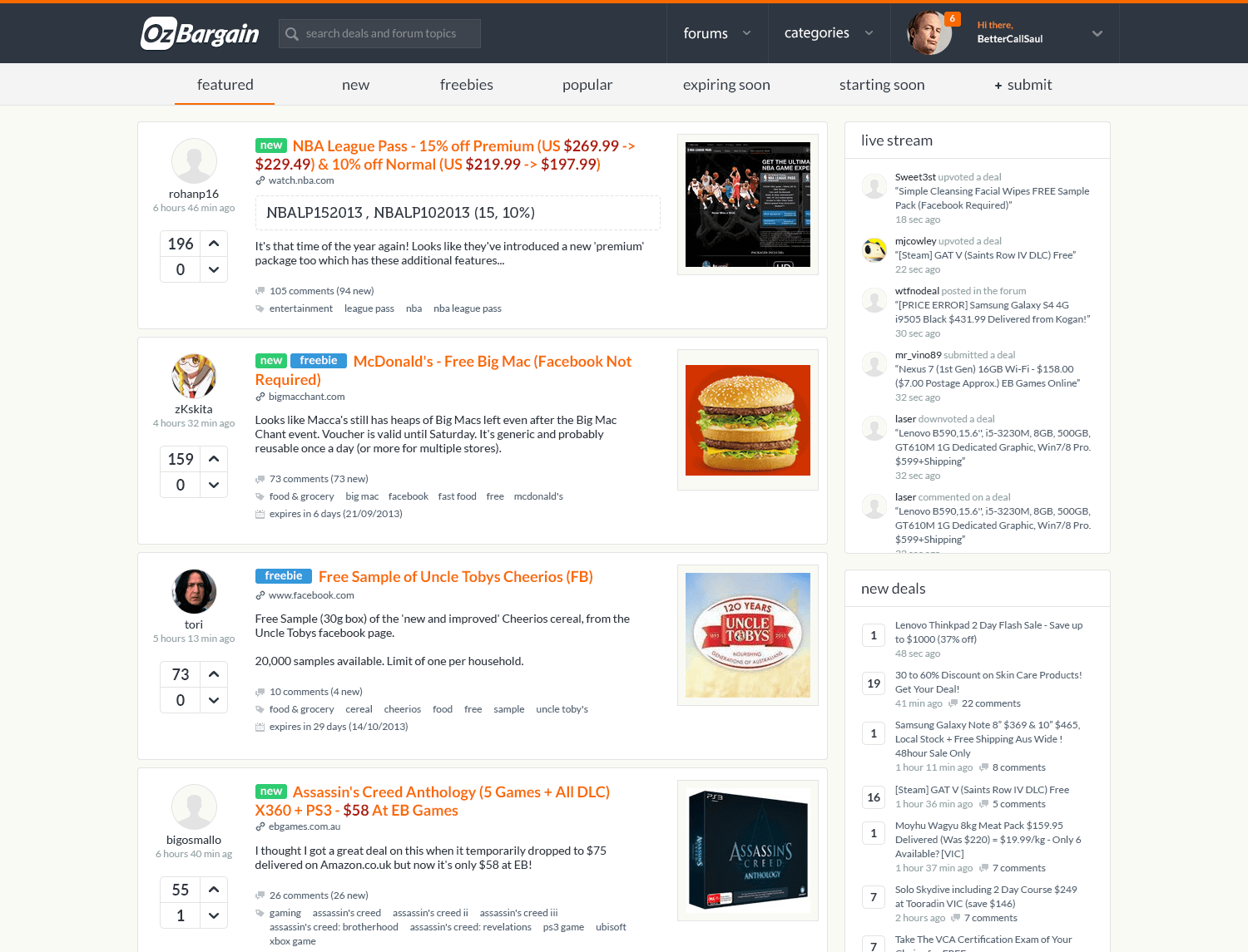
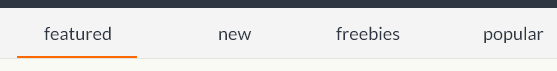
The header menu needed to be cleaned up as a lot of it is repeated if you hovered over Deals. The categories were already displayed underneath the main header menu, so this is redundant.
Solution
The site already had logic built into it where it displays the most up-voted deals first, however the old design never communicates this to the user. To view new/just posted deals, you had to click on the Deals section of the navigation bar. A lot of people that I have spoken to had no idea they were able to do that. The solution was quite simple for me as I simply reorganised those links and placed them under the main header.
As mentioned earlier, I wanted the user to feel like they owned their account. I felt that I achieved this by having their display picture shown prominently on the top right corner of the header. If the user had any notifications, it would make sense to also have this appear near their display picture.
The rest of the page just needed some cleaning up. I maintained the colours used in the original, but made the menu dark grey-blue so as to not detract from the main content of the site. I added the brand’s orange colour to the title links and added tags next to them so that users are able to identify at a glance if a deal is marked new, expired, freebie etc. I updated the logo in Illustrator to be more modern and aligned with the new design.

Challenges
Obviously since this was a side project, I had no client to work with and provide me their thoughts. I also did not have access to any analytics so a lot of my thoughts were assumptions. This is never the best way to tackle a problem as a UX Designer, so I made this redesign based on what I would have preferred as a user.
Thoughts & Conclusion
Overall I am quite pleased with the results. I didn’t want to spend too long on it so I only made the main top half of the site. I sent it to the site owner, Scotty as a form of a fan mail and he replied to me informing he liked it and would steal some ideas! I’d like to think that I had a part in some of the new site elements & features today ;)