OpenAgent
Overview
OpenAgent aims to help Australians make great decisions about the real estate agent they’ll entrust with their most important financial asset. They needed to redesign their agent profile page to better match the new homepage, as well as make it more useful for the user.

Problem
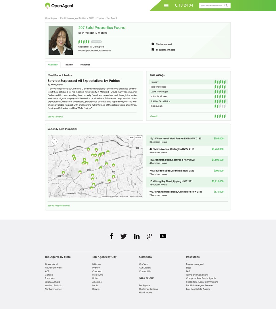
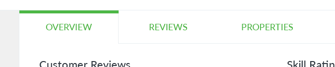
The old design of the profile page had made too much use of a pale-green colour. It doesn’t look appealing and in my opinion cheapens the brand. I also felt that the user had no relief/breathing space between all the different sections. It is overwhelming to look at as it was information overload. The tabs Overview, Reviews and Properties gets lost and hard to find amongst all the other sections.
It was also strange that the page did not show the agent’s name. This must’ve been overlooked upon as it is quite important information. The addition of the map is a good idea however I feel that by using the OpenAgent logo makes it look too cluttered.
It is a missed opportunity by not having any call-to-action buttons to contact this agent.
Solution
It was initially briefed to just redesign the page to keep it inline with the new homepage with a couple of additions, however after redesigning it, I felt that I could do better and re-do the whole page. I sent them both versions and they preferred the one I came up with 😊
My thoughts were, being an agent profile, you want the essential information appear at all times (as with the original). However having it kept at the top took up too much valuable space for everything else. By placing the agent’s picture on the left where it can always be seen, we can have important information with call-to-action buttons there at all times.
I was also not a huge fan of the previous design’s review icons. I opted for something that everyone understands.

Thoughts & Conclusion
The client was very pleased with my solution and I’m glad I stuck with my gut and re-did the design even though it was initially briefed for just a simple redesign based on the old one.
With the help of white space, the content overall looks more organised and coherent. It is easy to follow and information is easier to digest.