OpenAgent
Overview
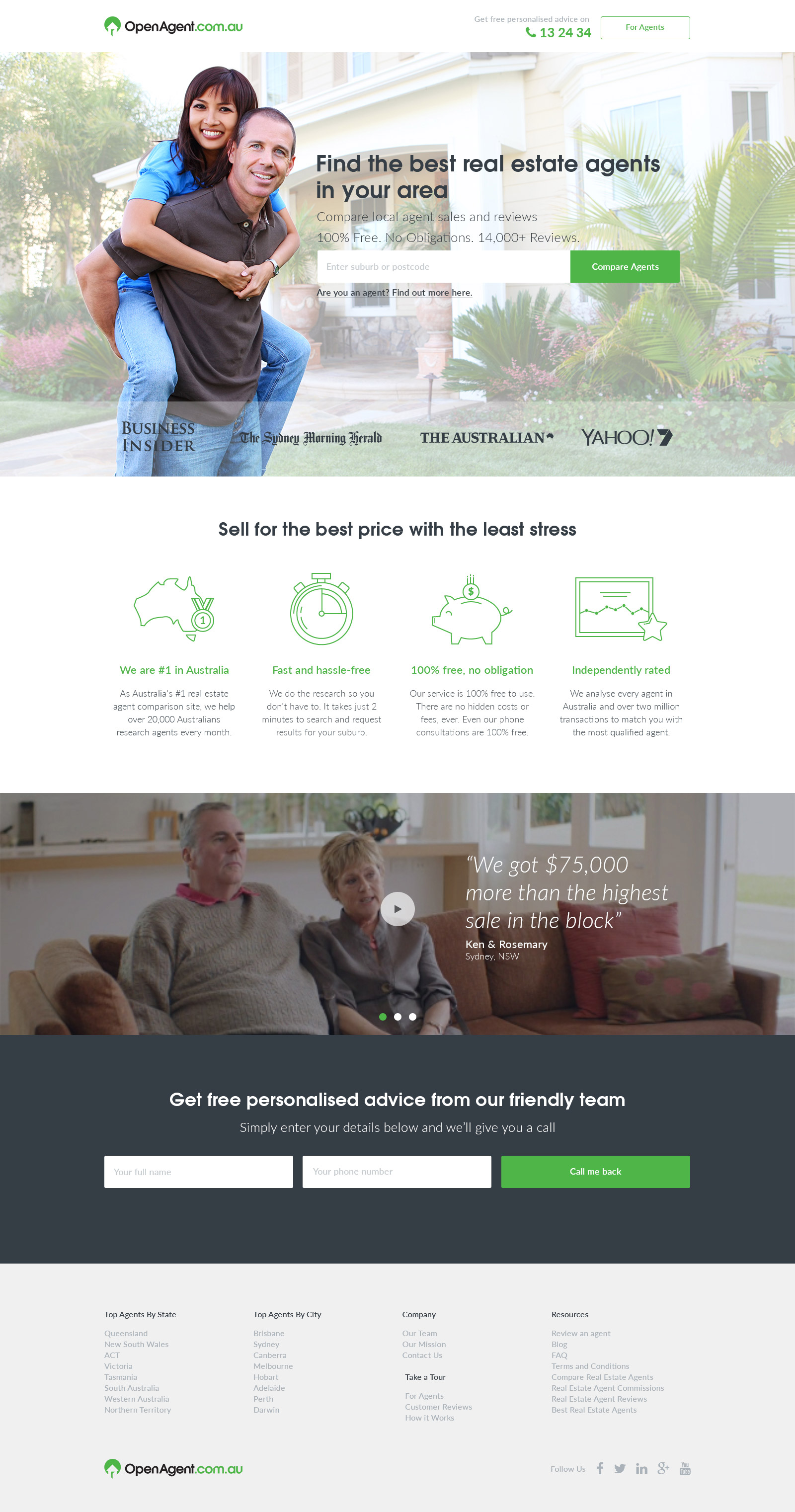
OpenAgent aims to help everyday Australians make great decisions about the real estate agent they’ll entrust with their most important financial asset. It was time they established their prescence on the market with a beautifully designed homepage and strong branding.
Problem
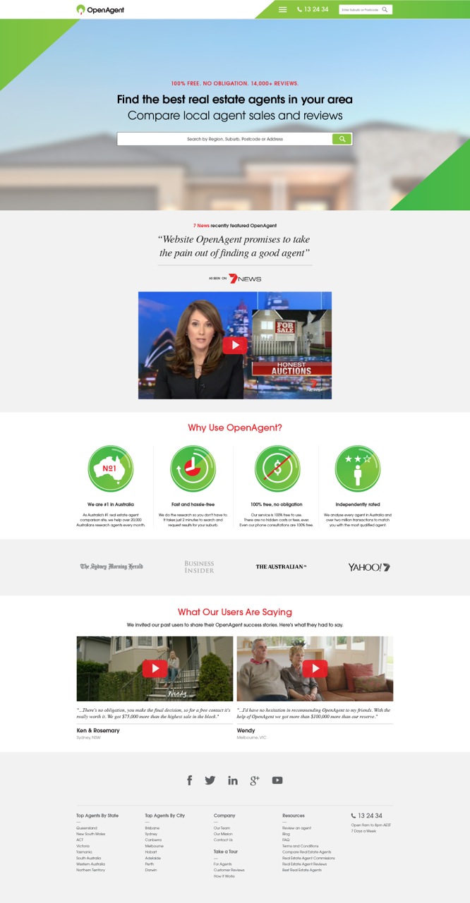
When first founded, design was last on the list and the website was mainly there to serve a purpose: lead generation. They were growing rapidly and realised they needed a stronger brand identity.
I agreed with them that the old design looked too busy and lacked a lot of personality. It also looked quite outdated and therefore unprofessional.
Approach
I worked with their UX Designer to complete the redesign. They already had wireframes for the project and were quite happy with the hierarchy, but I made a few suggestions for some sections to be moved around.
We communicated mostly via email and some phone calls. If I had an idea I would do a quick wireframe and send it to their UX Designer where we would further interate and refine together, while also taking into the CEO’s opinion as well.
Solution
UX
I felt that the “as seen as” logos should be moved up closer to the search field as they are a new company that has not established trust yet. Including well known logos such as The Business Insider and Yahoo7! helps solidify their presence within the market, increasing the level of trust between the brand and the user.
The end goal for the homepage was to do as many A/B variation testing so a lot of the sections and wording could be moved around. The redesign was a good starting point for it.
Design
The client mostly wanted a more modern look and feel of the website so I kept as much of the existing branding as possible from the supplied offline marketing material (fonts, hero image, green colour). I honestly felt that the old design was almost there, it just needed to be cleaned up and polished, so-to-speak.
Icons should be supportive to the text and the old design was too “heavy” and distracting, achieving the opposite effect.
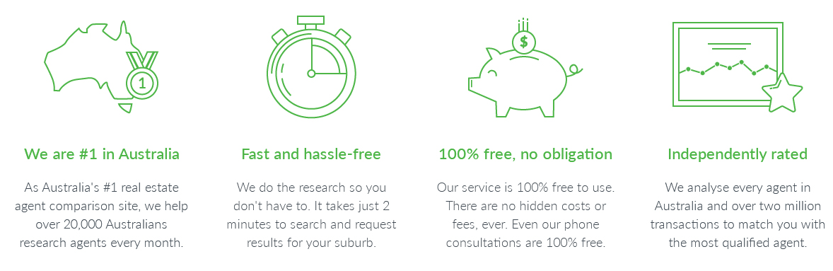
The result is easy on the eyes and fully supportive to the copy. I supplied the developers with .svg versions of the icons to ensure scaleability when viewed at any resolution and dpi/ppi.
The client did not want to include the “As seen on” video but still wanted to keep the testimonials. To keep the design as clutter-free as possible, I turned the videos into a non-auto-moving carousal with a quoted text that I felt was engaging and easy/quick to read at a glance.
Thoughts & Conclusion
I had site performance concerns for the use of the Avant Garde font as it’s not a webfont. I also preferred to have kept it consistant across the site using the secondary font (Lato) and it also matched the more modern look of the new site. I understood the reasonings that they had preferred Avant Garde since it was already prominently used in their offline material. As a compromise, I only used one font-weight for Avant Garde which should help with site performance.
Even though I mostly communicated with the UX Designer via emails, I enjoyed the level of collaboration and team work involved. I sent through so many different variations through and after each one we got better and better at sharing the same vision for the site.
I believe we achieved a great result given the turnaround time was 5 days from start to finish (for the whole project).