Homeloans
Overview
Homeloans is a loan comparison website for Australian home buyers. They focus their marketing spend on SEM (Search Engine Marketing) as it attracts people who are actively looking for home loan comparison. In addition to their existing products, Homeloans wanted to start offering their customers a free phone consultation. The phone consultation is to asses the end user’s needs and advise of the best home loan option according to those needs.


Problem
Most landing pages you’ll find on the internet do not look trustworthy enough to provide them with your information. People are becoming more aware of scams these days and are increasingly weary of providing personal details online. This is an issue we must overcome with the design.
So the task itself seemed quite simple, but to get there requires good design-thinking to convince users that you are trustworthy!
Approach
I started with the banner first, since this is what the user will see before the landing page. The banner must pique their interest, as well as look trustworthy enough for them to engage.
I put myself in the audience’s shoes and thought back to when I was looking at home loans. I remembered that it was quite overwhelming, but I also had a broker help me. Knowing this, I immediately knew how I wanted the look and feel to be like. I began searching for stock photos that represented having a professional assist you. As for the website, I wanted to have a similar correlation but not exactly the same as I wanted the messaging to be a more convincing and impactful, so I needed an image that supported that. I wasn’t exactly sure what that messaging would be, but I knew I would figure it out as soon as I found the right image.
I did not want anything complicated or fancy. We see enough banners these days where we just look past them. I already have the advantage that the banner will appear on home loan comparison sites so I knew the audience would already be interested. I just needed to convince them to click!
Solution
UX
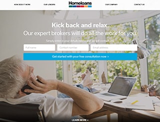
The visual hierarchy of the landing page must be straight the point where the user knows exactly what they needed to do without thinking too much about it.
As soon as you land on the page, you will see the form right in the middle; no distractions. If the user wanted to learn more, they can either scroll down or click on the links above (which serves the same purpose since it is all on one page). They were mainly there to support the trust I wanted to build. Information should be easy to find, else you risk making the page looking like a scam. The idea was to have this top-section of the webpage fill the entire browser.

The visual hierarchy is important in this landing page as you need to meet the business requirements, however this is only half of the equation, as the design aspect is just as important since you need to convince them that you are a legitimate company and not out to scam them. On the surface it looks quite simple, but you need a good balance between meeting business goals, as well as good design to achieve it!
Design
The client gave me creative freedom for this project. This included copywriting. Having found the perfect picture that captured the moment I wanted, I just needed supporting text to accompany the vision. I came up with Compare homeloans with a mortgage broker today! I just needed something short and snappy. The call-to-action button needed to get the user to engage. Everybody loves free right? You’d be surprised that many people do not know that mortgage brokers are free (banks pay them commission). My call-to-action text reads Get your free consultation now.

Get paired with free achieves two purpose: informing the user that it’s a free service and encourages the user to engage by clicking. Two birds with one stone!
Half of the battle is won once the user is on the landing-page. Now to convince them to part with their information. This page is where I needed to really convince them!
Here I wanted the user to feel that the process of getting a consultation with a broker to be as easy as possible. Again, I wanted to the user to envision themselves to be stress-free. I found an image of a man talking on the phone looking quite relaxed and happy. The image I found is exactly the image I want them to envision themselves in. Having the image take up the full width of the browser serves as a constant reminder

The next line reaffirms the action I want the user to take, as well as inform them of the expected outcome: Simply enter your details and we will contact you.
As for colours, blue is known psychologically to be a trustworthy colour. I used this in the call-to-action button. It has a calming, trusting and non-disruptive feel to it. The background images in both the banner ad and landing page were slightly blurred and had a subtle colour overlay so as to not distract but also be there to support the goal. The homeloans logo is prominently in the top-middle and informational links is easy to find. Psychologically, using images of real people, rather than cartoons or drawings gives the image of trust.