Mwave
Overview
Mwave is one of Australia’s leading online IT stores. The homepage has had a few redesigns in the past, however the checkout has been largely left the same.
Problem
The old checkout user flow is quite clunky. There were too many steps to achieve a simple goal: purchase the items quickly and painlessly. It was also not responsive, therefore making mobile transactions very frustrating to use.
The previous design was a copy of Amazon’s checkout. While it may have worked at the time as a quick fix, over time with additions to the checkout such as mwave dollars (store credit) and various delivery options, the checkout became too cumbersome to navigate and confusing for newer users.
The design was also not aligned with the rest of their branding eg. different button styles, font sizes were all varied, some sections were not aligned properly etc. It definitely required a much needed “designer’s touch”.
Solution
UX
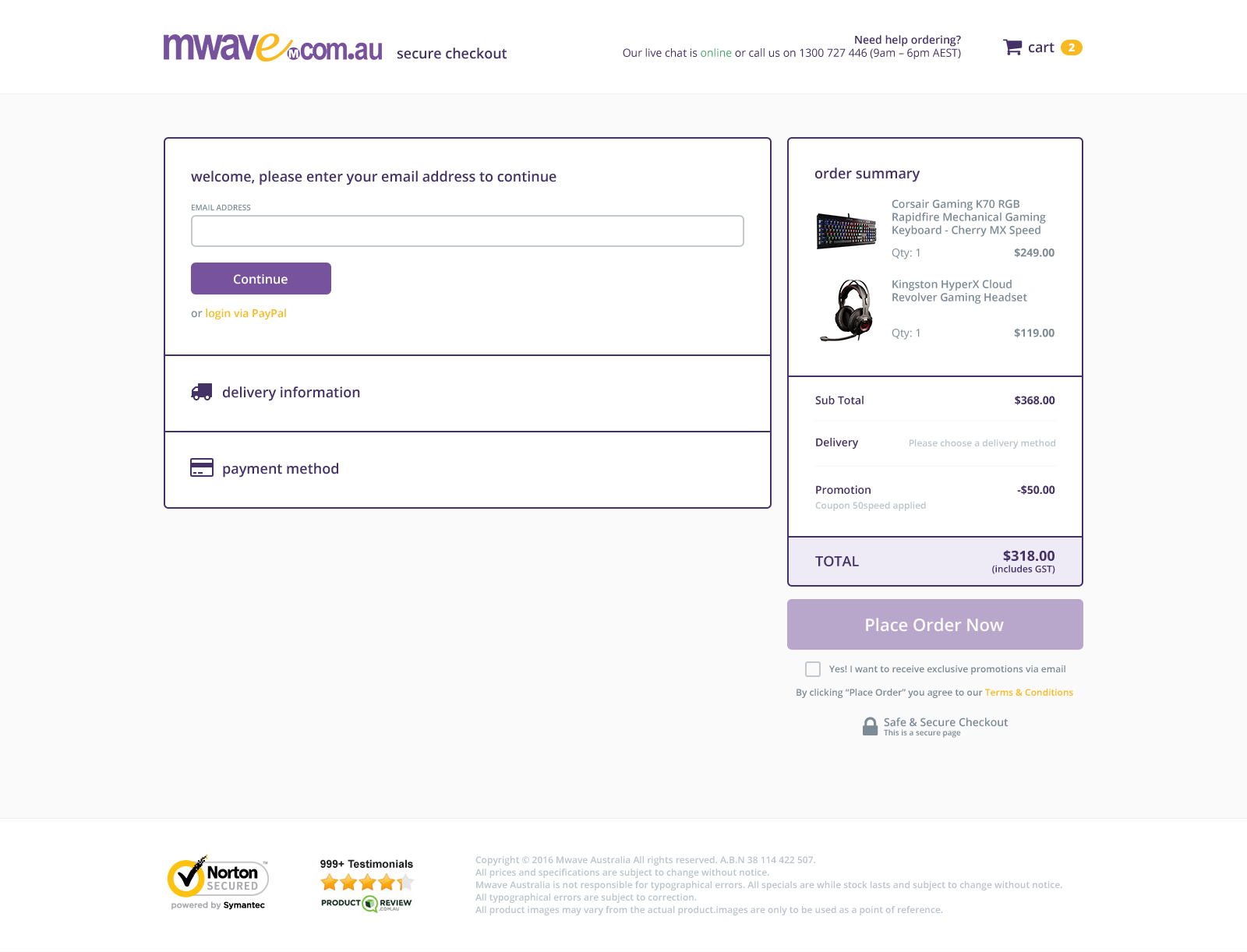
Many users (such as myself) tend to forget they’ve already made an account with a website. During the checkout process, you want the user to complete their transaction as soon as possible, so instead of having two columns asking the user to pick an option (login or create an account), I consolidated this into one simple field: Please enter your email address.
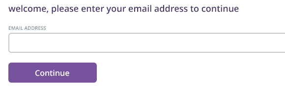
The form will validate whether or not the user already has an account and will present them with the proper step (create or enter your password).
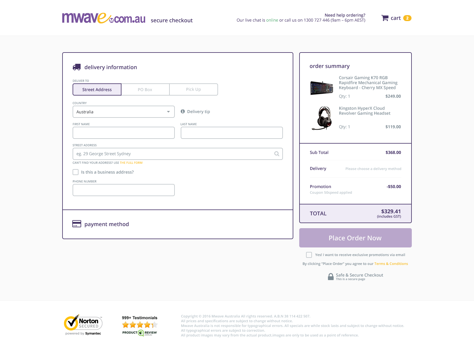
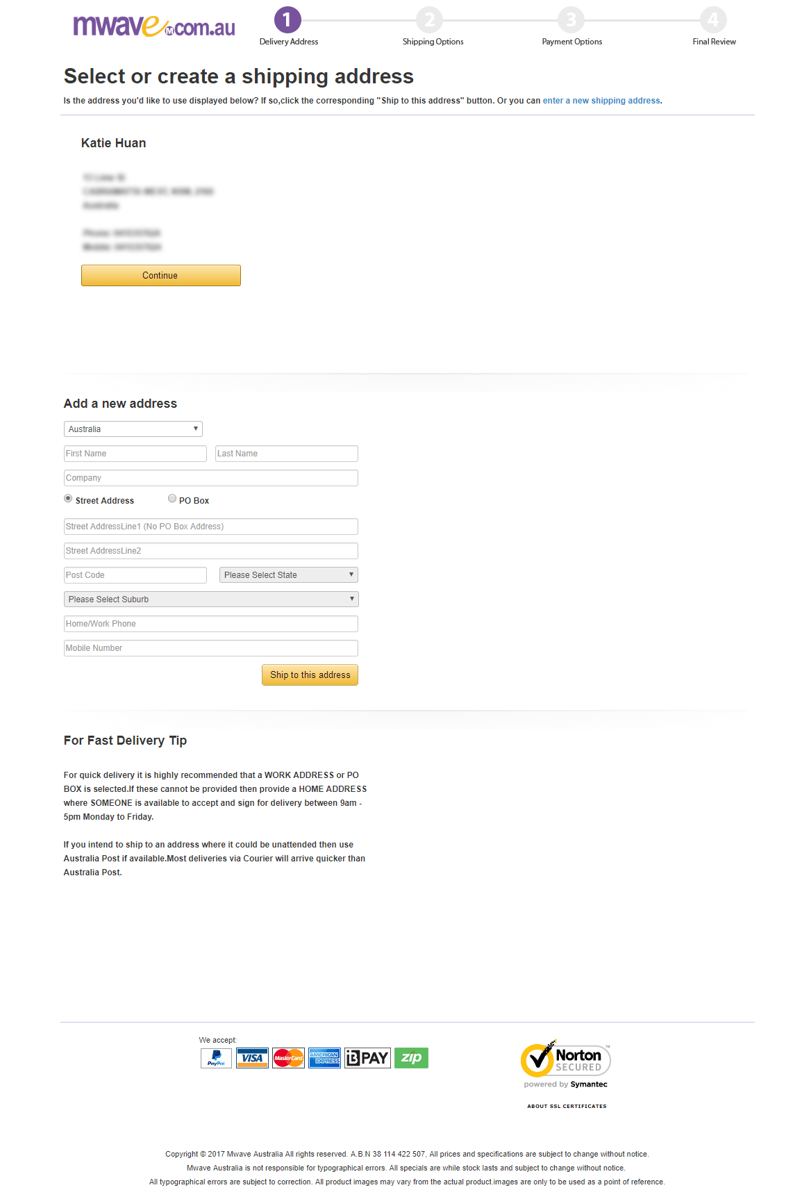
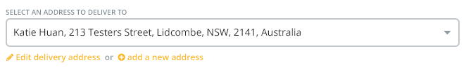
Upon successful login, the user will be presented with delivery information. Existing users will already have their details saved and in most cases, would glance at this section to make sure it’s the correct address and move onto the next.
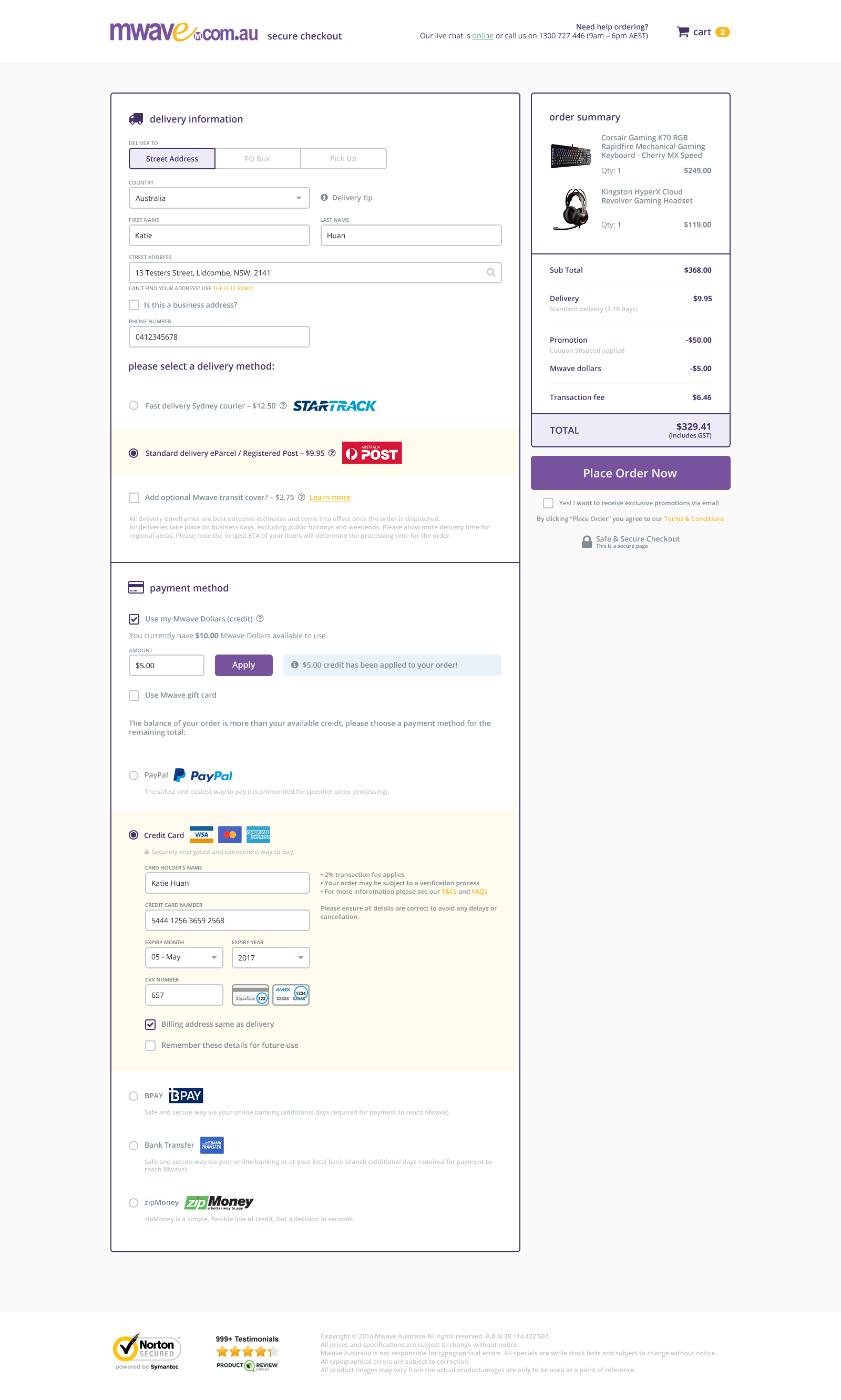
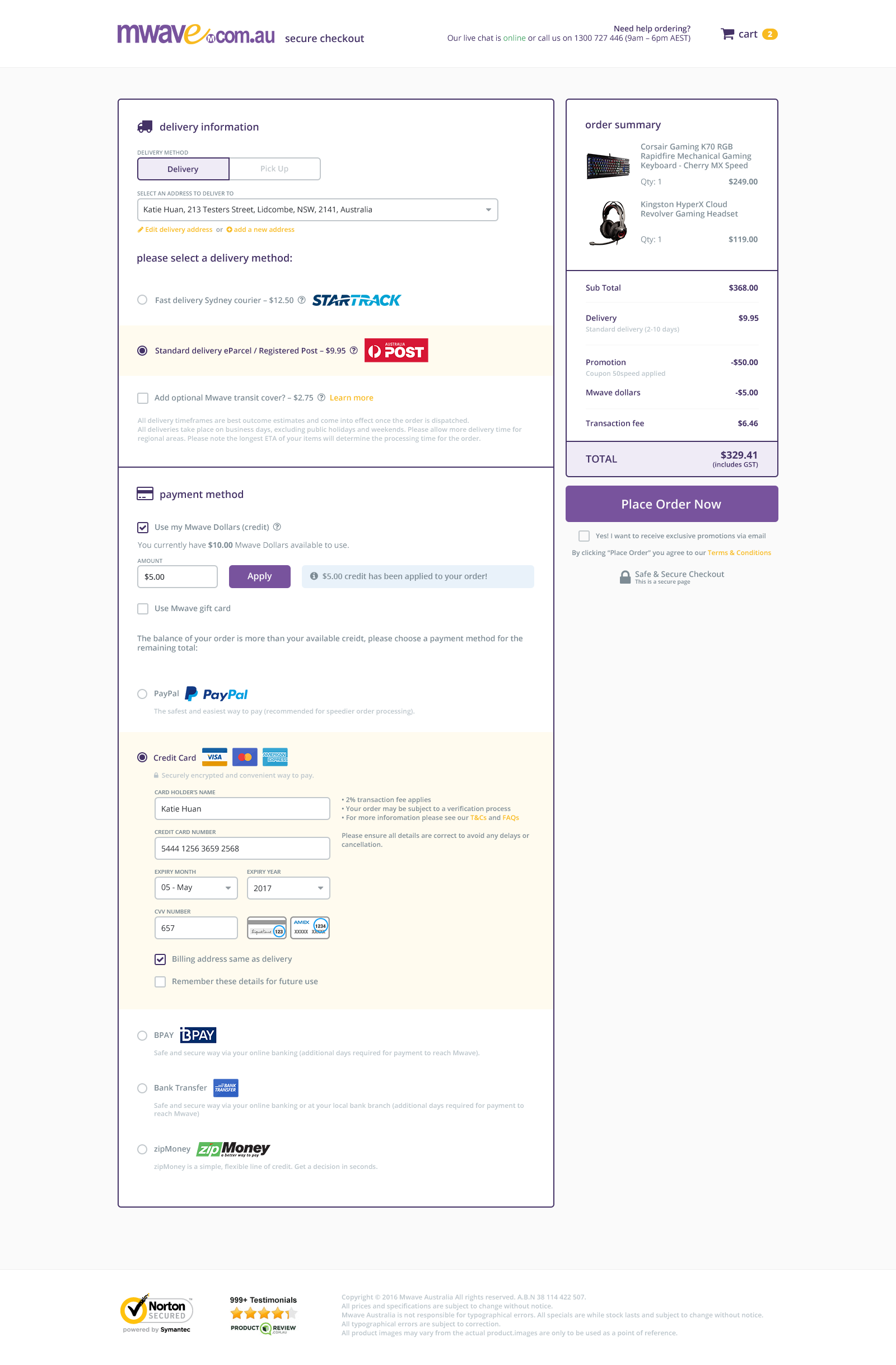
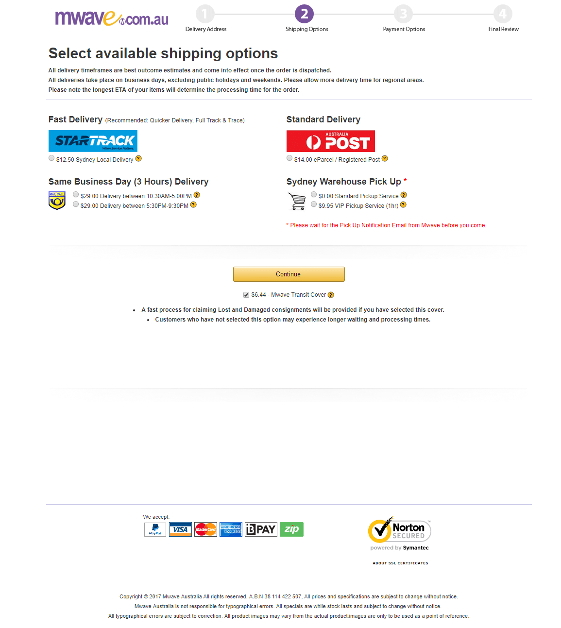
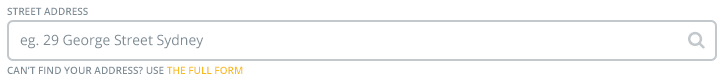
New users will have to enter in their address, which would be in the form of an address-lookup, thereby reducing the amount of incorrect addresses being entered. The previous form did not have this and they had many incorrectly delivered parcels, which led to customer dissatisfaction. After entering or selecting their address, they will be presented with delivery methods.
The payment method section has been cleaned up to be clearer and more trustworthy. The only difference is that the mwave dollars (credit) will only display if the user has any on their account. It will not display if the user does not have any. If they choose to use their credit, it will automatically calculate and update how much they have left and display the updated totals.
Once everything is filled in and has been validated by the system, the Place Order Now button will become active and the user may place their order.
Design
The purple and yellow colours from the mwave logo has been used throughout the rebrand. The previous design did not have much of a brand personality. This was because they did not make heavy use of colour. I kept in mind throughout the rebrand that the majority of the users of mwave are 20-40 year old males. I did not want to make the website look too feminine. Bearing in mind the purple and yellow colours are not what your average male would consider their favourite colours! With this in mind I made liberal use of the purple colour as it is darker and offered better contrast than yellow.
I’ve paid extra attention to ensure the colour schemes used here was not jarring for the user. I maintained its brand identity whilst keeping it up-to-date with current design trends. With a healthy use of white space, text line-spacing and icons, the redesign achieved a well balanced design of functionality, usability and aesthetics.
Showcase
Before
After
- Welcome screen
- Create a password for new user
- Finalising order for new user
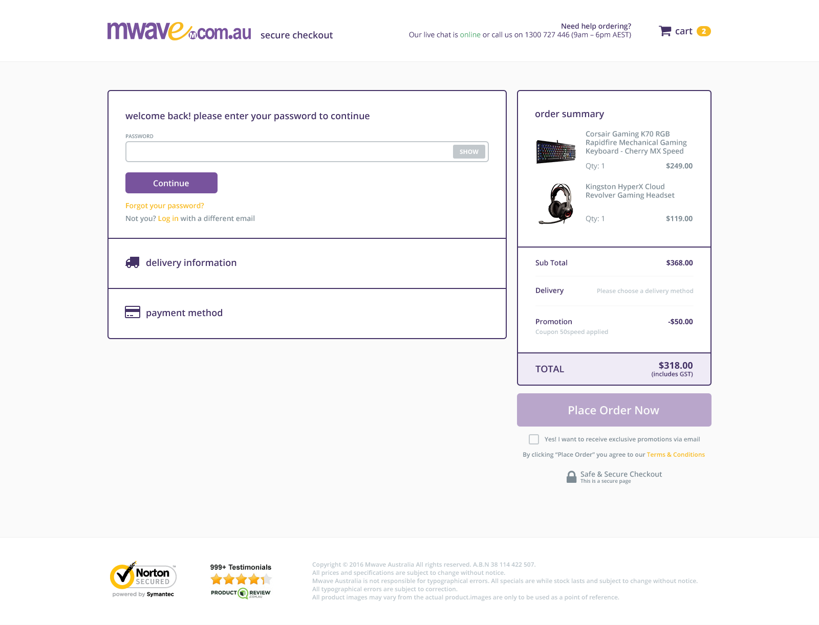
- Enter password for an existing user
- Finalising order for existing user
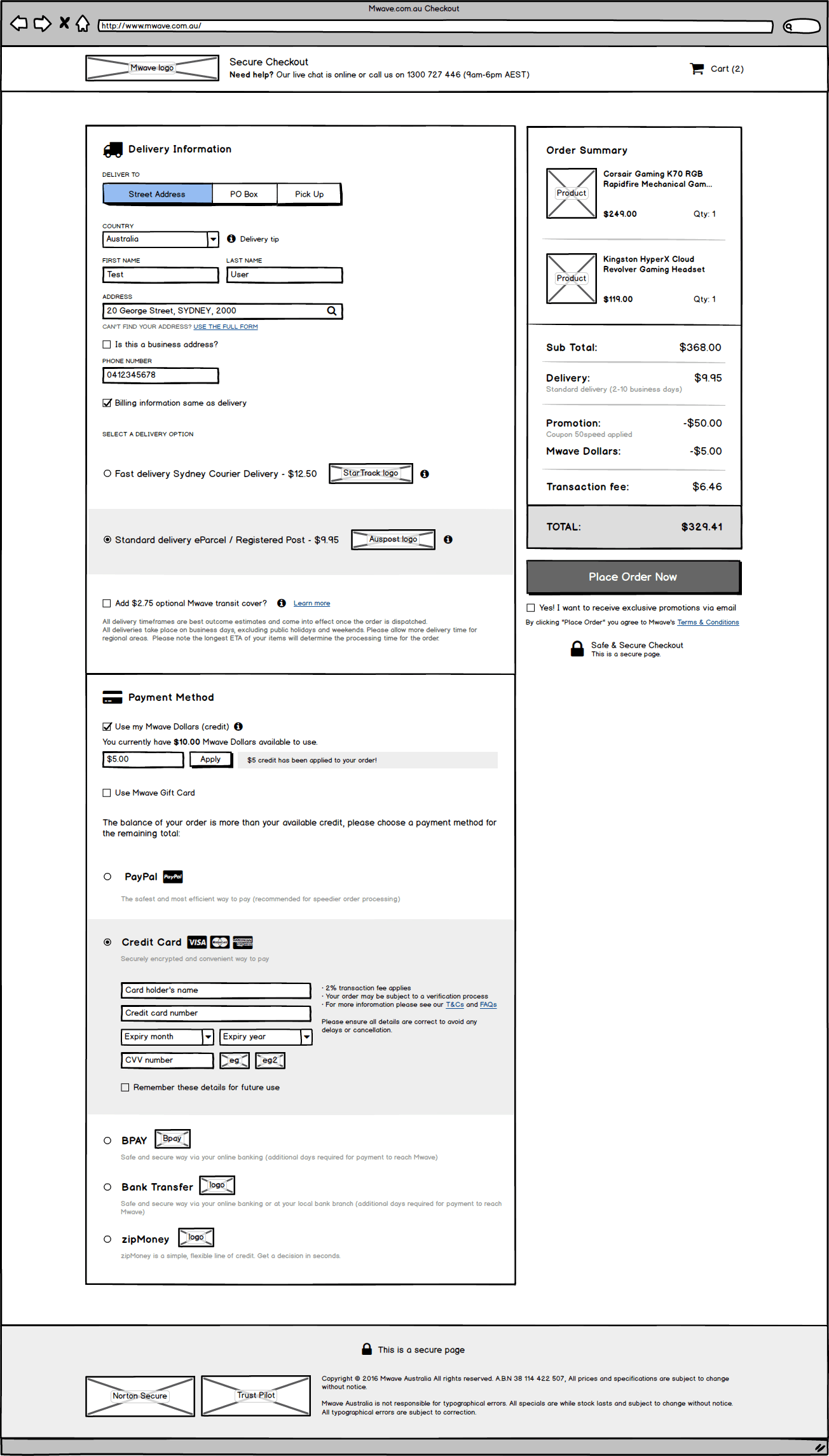
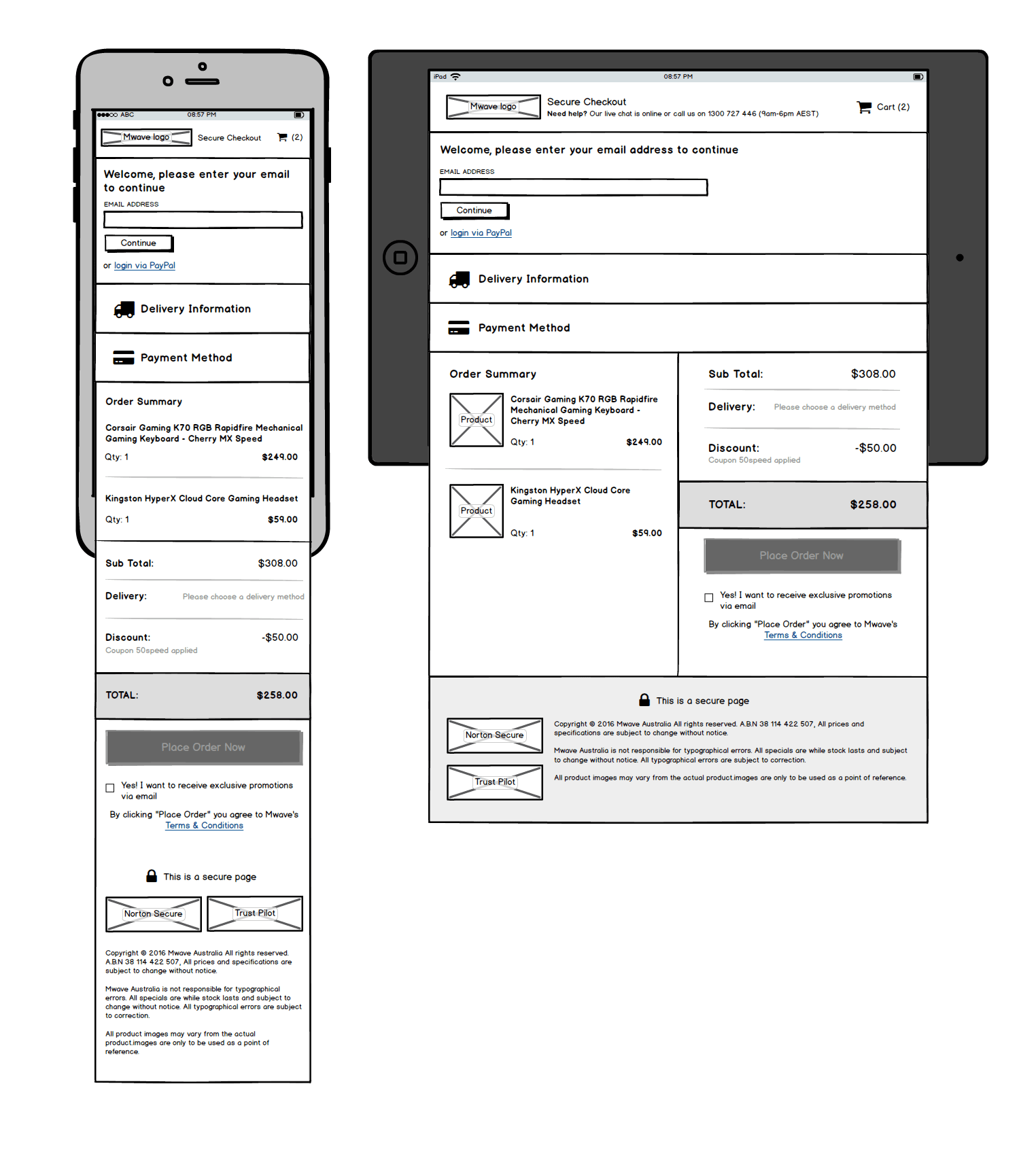
Wireframes